USER EXPERIENCE DESIGN
Improving usability and search functionality to minimize user attrition
CLIENT:
A non-profit online networking platform for higher education professionals to connect, supplement teaching resources and publish documents.
CHALLENGE:
Two years after the initial launch of the platform user engagement was declining and memberships on the platform were dropping.
VALIDATE:
I was the lead ux designer on the discovery and sprinting teams. My role on the project encompassed:
- Validate the problem via user interviews and member surveys
- Evaluate qualitative data and identify themes through affinity mapping
- Complete a heuristic review of the existing site to identify areas of opportunity
- Provide a written report and presentation to stakeholders with findings and recommendations
- Expand the existing color palette to include semantic colors that coordinate with the brand palette
- Create a User Interface Style Guideto strengthen the brand and help future sprinting teams
UX SOLUTION:
Drawing insights from both qualitative and quantitative data, in collaboration with the tech lead and product lead to gain a comprehensive understanding, we arrived at the following solutions:
- Enhance the user experience of search by incorporating existing search mental models and improving the legibility and scannability of search results
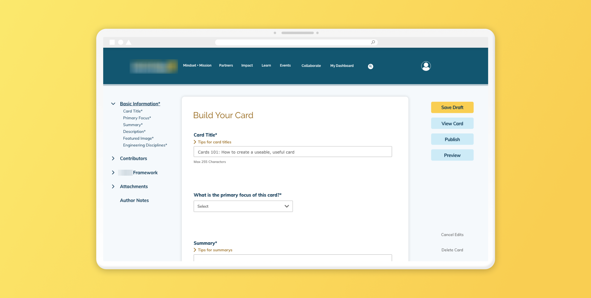
- Improve the content creation process based on findings from the user interviews and surveys. Focus on usability by guiding the user through the process, providing help in context, and organizing information in a logical way
RESULT:
Users were delighted about the improved usability of the redesigned search and content creation process.
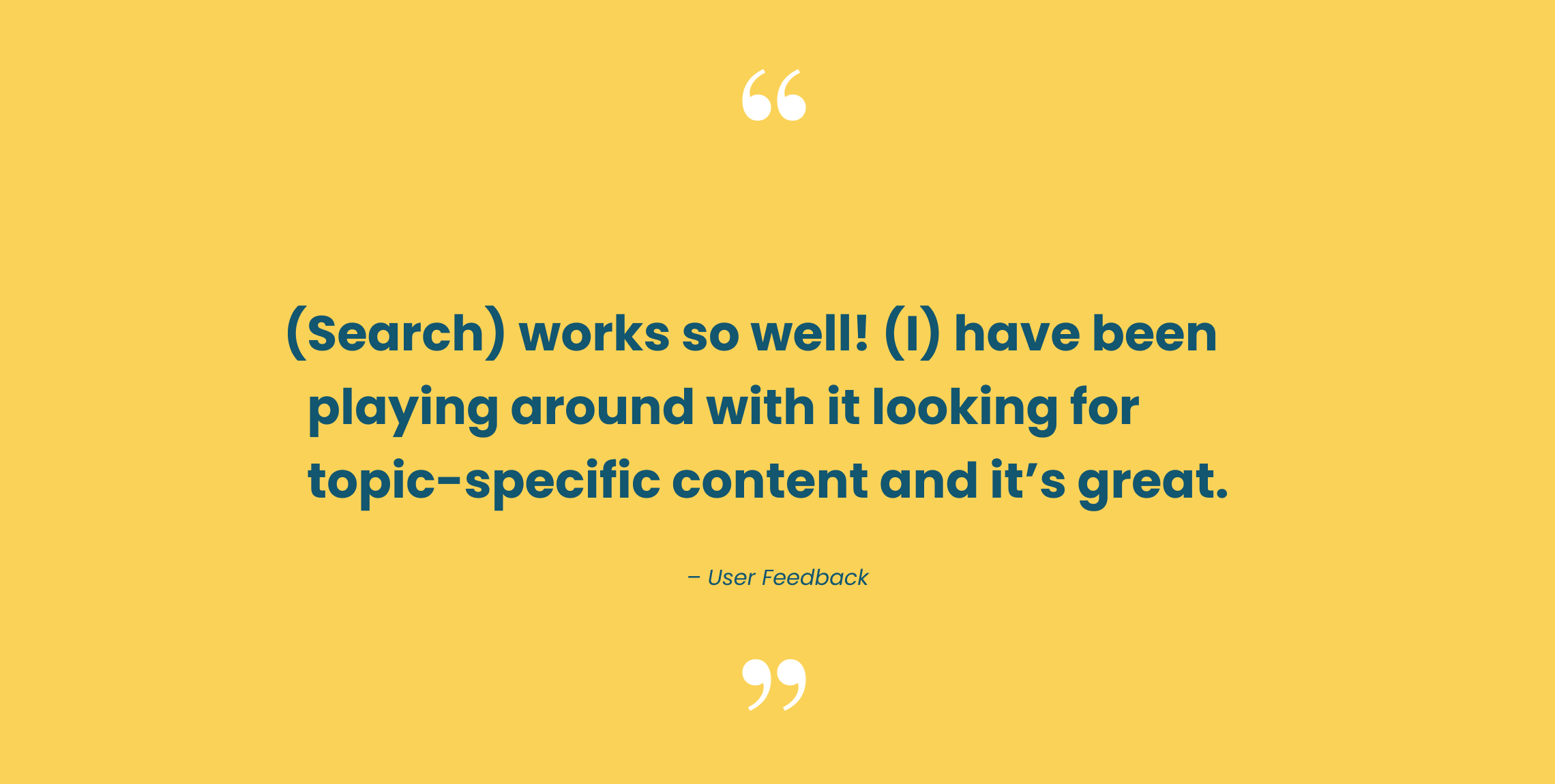
- “(Search) works so well! (I) have been playing around with it looking for topic-specific content and it’s great.” - user
- “Definitely an improvement. I’ve tried the new search and got quick and accurate results. Thanks for making this update happen!”
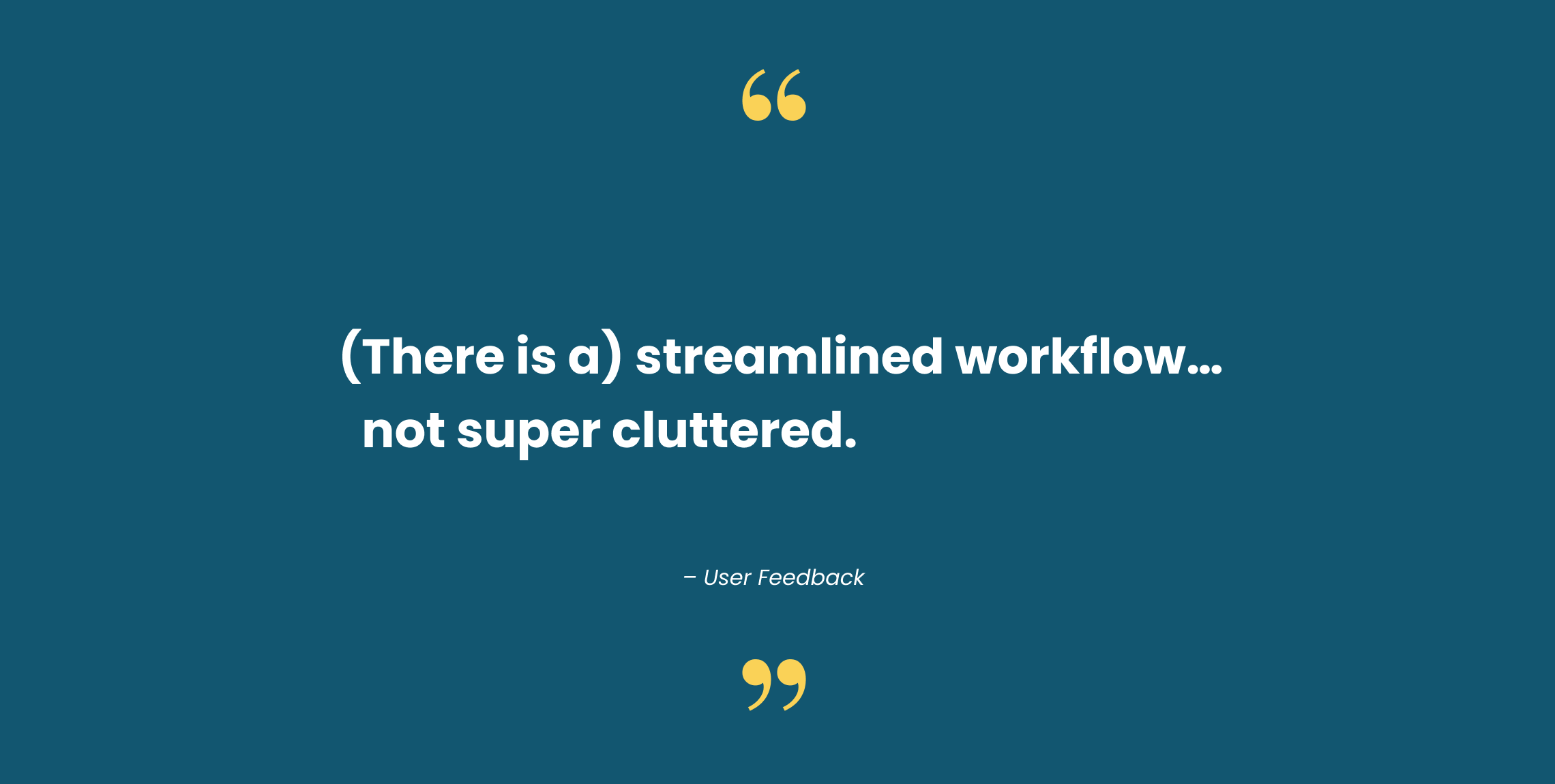
- “(There is a) streamlined workflow… not super cluttered.”